Supporting ocean scientists to understand kelp canopy response to and recovery from climate change through data visualization tools.
- Client: The Nature Conservancy
- URL: https://kelpwatch.org/map
- GreenInfo Team: Dan Rademacher, Maria Lamadrid, Tom Allnut, Tim Sinnot
- Project Year: 2022 to present
Overview
The Challenge
- Kelp ecosystems are highly dynamic and spatially variable, making it difficult to interpret trends without tools that support temporal and geographic exploration.
- Scientist and resource managers responsible for protecting, developing, and managing kelp canopies need actionable insights and often lack accessible ways to analyze decades of kelp canopy data derived from satellite imagery.
Objectives
- Make long-term kelp canopy datasets accessible and usable to scientists and resource managers.
- Enable users to visualize and analyze spatial and temporal patterns in kelp ecosystems through an intuitive web interface.
Results
- Kelpwatch.org a web-based visualization platform that enables interactive exploration of kelp canopy dynamics across space and time to analyze 38+ years of satellite-derived kelp data without requiring GIS or coding expertise.
The Work
The History
Kelpwatch emerged from a collaboration between scientists, conservation practitioners, and technologists seeking to operationalize decades of satellite-derived kelp canopy data. The platform visualizes 30+ years of kelp canopy data from the West Coast of the US into Southeast Alaska, Peru and the Falkland Islands.

The Nature Conservancy led the effort to transform this dataset into an accessible decision-support tool, supported by DevSeed’s work on the backend, while GreenInfo Network leads the front-end design and web development.
Design Process
I was tasked with improving the clarity of data and resources that could help intended users employ the tool. I approached the project as an exercise in reducing the barriers to access while preserving analytical depth, creating a space where users could explore change over time without being overwhelmed by the complexity of the data.
We made design choices to support clarity, comparability, and inclusive access by: separating complex information into digestible views; prioritizing legibility across visualizations; and creating multiple pathways for interacting with the same dataset.
The interface prioritizes clarity, accessibility, and exploratory analysis:
- A map-first experience highlights kelp presence and change over time
- Time-series charts complement spatial exploration
- Interactive controls allow users to select regions, timeframes, and seasons
Design decisions were informed by comparative research, emphasizing:
- Simple basemaps for clarity
- Clear indication of where data exists
- Integrated map and narrative views
The project also surfaced areas for improvement, including accessibility (e.g., color contrast, reliance on mouse interaction).
Assessments and users
I defined and applied evaluation criteria for a comparative analysis of peer platforms grounded in W3 Web Accessibility Consortium Guidelines. The evaluation provided comparisons to explain to our client the best practices for improving access, such as:
- Strategies for how to improve basemaps for low vision.
- Flexible ways of exploring time-based data
- Demonstrate that users need multiple ways to define areas of interest (not just drawing on a map)
- Visualizations like line charts are essential complements to spatial data for interpretation.
Through multiple interview rounds and a survey with intended users, I was able to identify the unique feature that supported data interpretation and visibility, as well as opportunity areas for improvements. At the end of each interview cycle, user-generated suggestions were translated into wireframes. The wireframes were created through an internal paper prototyping exercise and later used for discussion with clients and further iteration with users.
Visual Design
I hosted a quick paper prototyping exercise among GIN staff to generate ideas for workflow solutions. Based on the decisions made as a group, I developed two visual designs in Figma that showed how users would move through the application, from the homepage, choosing areas, and reviewing outputs.
During the design process, I also developed multiple chart visualization approaches. This helps provide context for users who commented that charts with multiple lines were hard to interpret.
Legibility
The primary time-series visualization was intentionally split into distinct charts, allowing users to focus on one dimension of change at a time rather than parsing overlapping signals within a single graph.
This separation improved readability for all users, while also supporting those with learning and processing differences by reducing visual clutter.
Based on our research, we design a map visualization approach that foregrounds where data exist using exaggerated Hex shapes.
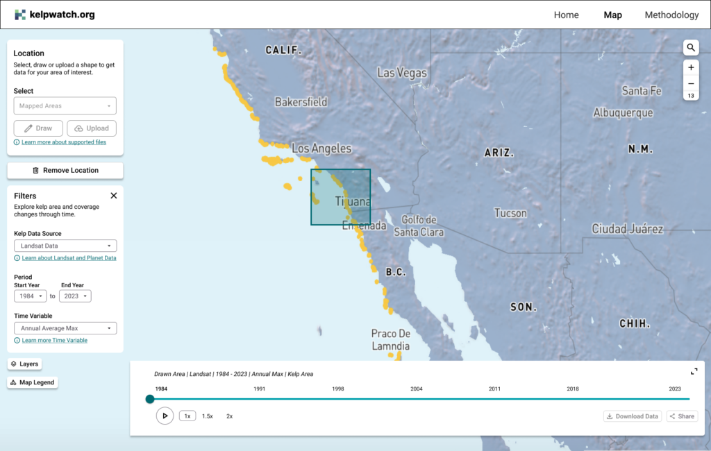
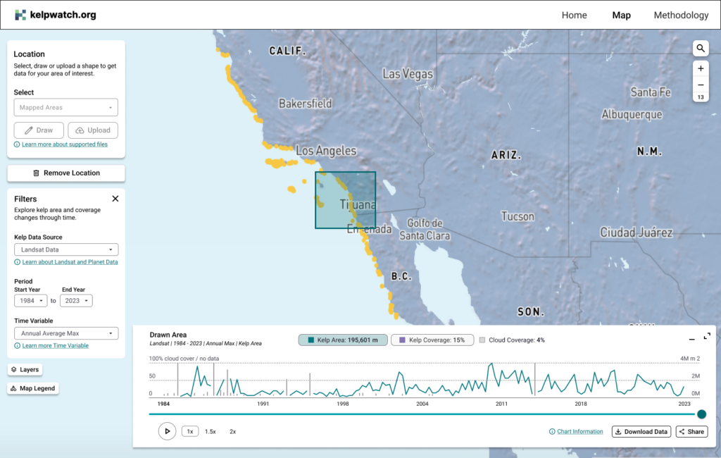
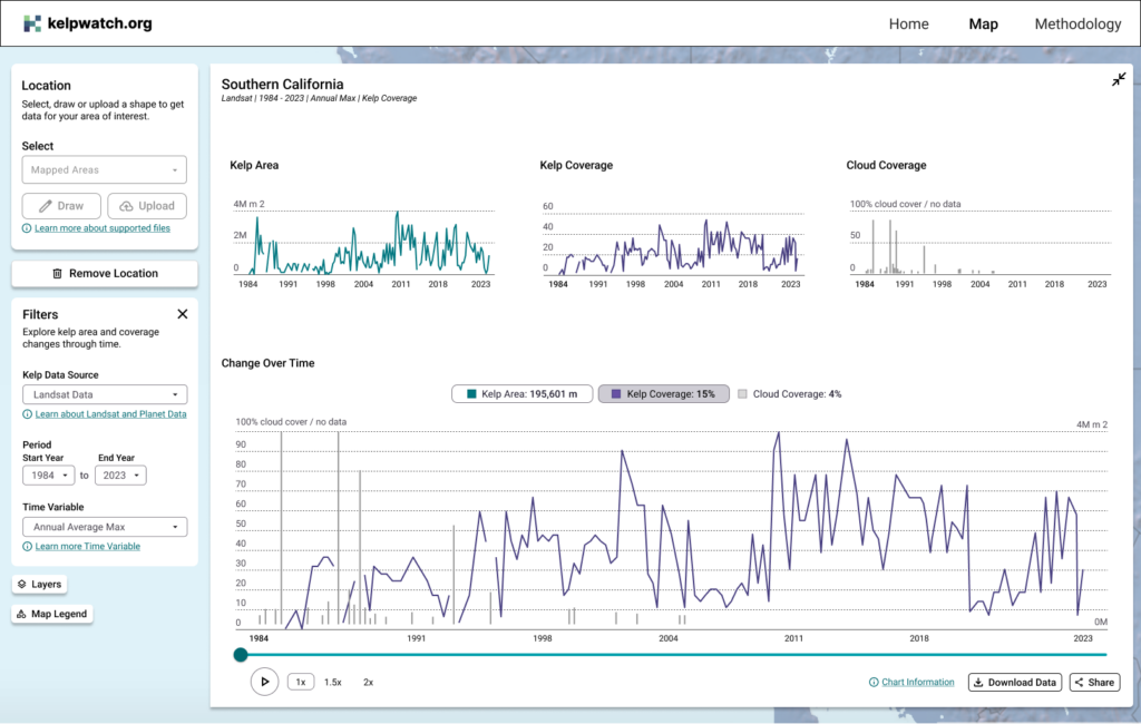
Gallery images for Redesigned Kelpwatch: 1. Interface with an area in Southern California selected, and the time player collapsed. 2. Interface with an area in Southern California selected, and the time player expanded “half-way” where a user needs to decide if they want to view Kelp Coverage vs. Kelp Area charts. 3. Interface with an area in Southern California selected, and the time player fully expanded, where a user is able to view different diagrams simultaneously, defining Kelp Coverage, Kelp Area, and cloud coverage for the same point in time based on the timeslider.